A grounded color palette
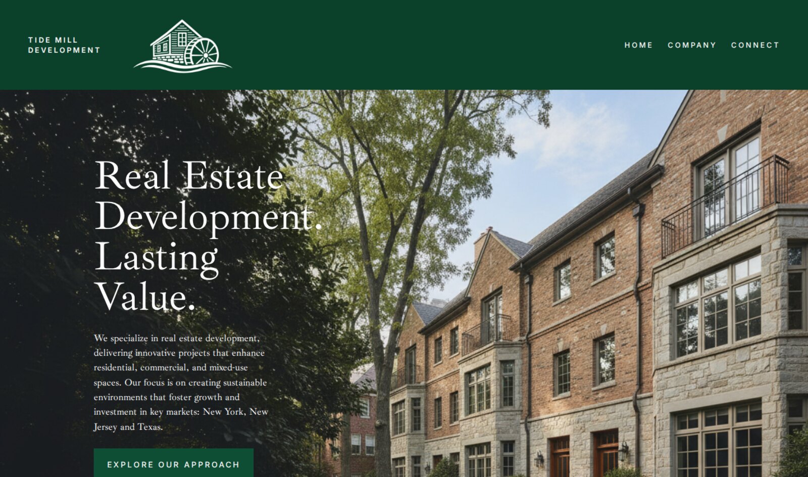
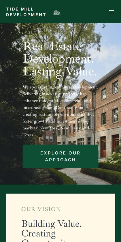
A deep forest green anchors the header and calls to action, paired with warm cream panels. The palette feels natural and enduring, reflecting a company focused on lasting value.
A redesigned digital presence for a real estate development company specializing in residential, commercial, and mixed-use properties.
The project focused on creating a refined, professional website with intuitive navigation, cohesive branding, and a clean visual presentation.
I led the project end to end as the website's designer and developer: shaping the site structure, creating the visual design, and building the finished responsive website.
A deep forest green anchors the header and calls to action, paired with warm cream panels. The palette feels natural and enduring, reflecting a company focused on lasting value.
Large serif headlines give the brand an established, editorial voice, while spaced uppercase navigation and buttons keep the interface crisp and easy to scan.
A full-width hero photograph of finished residential architecture lets the work speak first, with the headline and introduction layered clearly on top.
A short menu of Home, Company, and Connect keeps visitors oriented, and collapses into a clean mobile menu so the experience holds up on any screen.
Learning about Tide Mill's residential, commercial, and mixed-use work, its key markets, and the professional impression the site needed to make.
Organizing content into a clear page structure and simple navigation, so visitors can quickly understand the company and get in touch.
Developing the visual direction, including the green and cream palette, serif typography, and image-led layouts, then refining it with feedback.
Building the approved design as a fully responsive website, testing it across screen sizes and browsers, and taking it live.
See the finished site live.